New Interactive Map: Variations in Medicare Costs
It's no secret that getting health care spending under control will be key for the federal budget. Nearly one out of every four federal program dollars goes to health care, and even though growth has slowed recently, it is expected that it will pick up again at least to some extent as the economy improves.
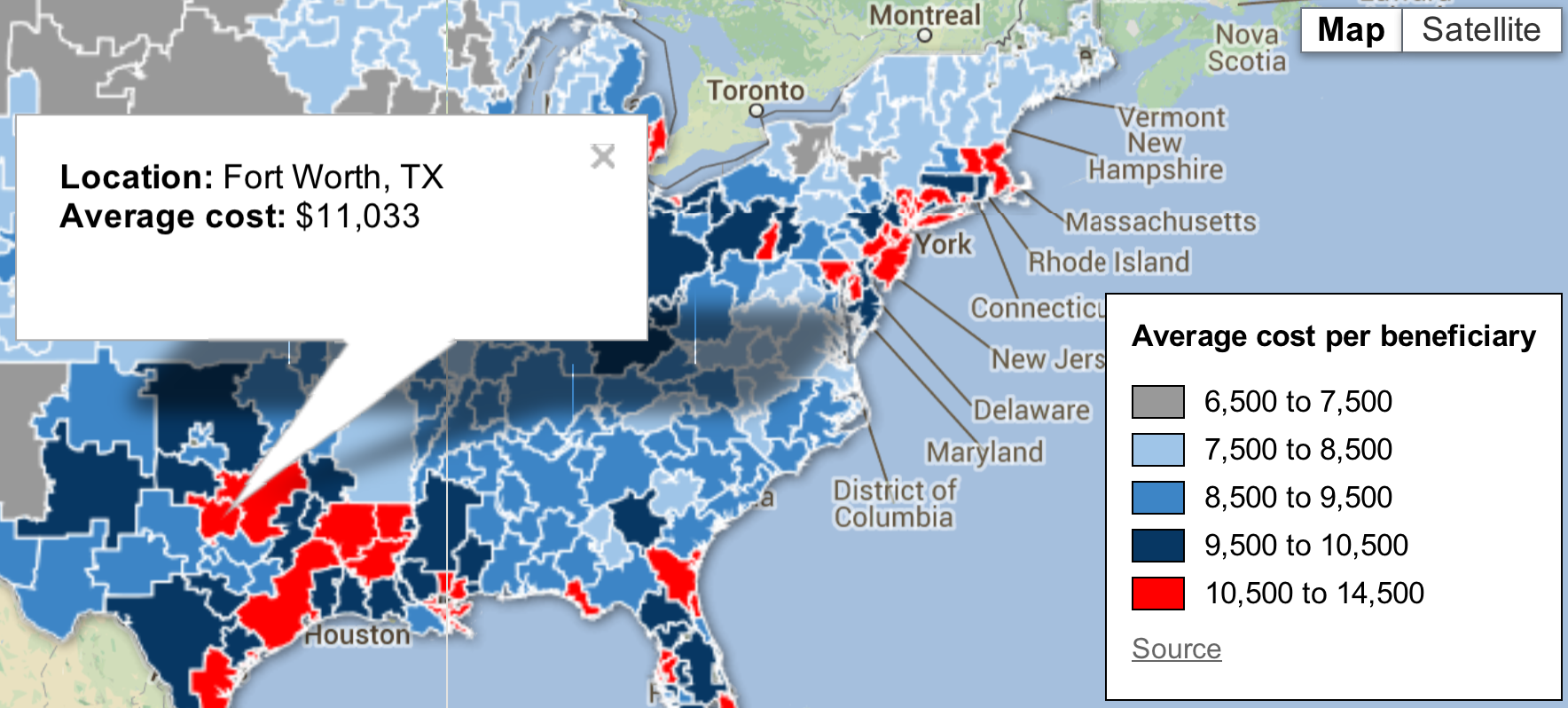
One key to reining in health care spending is figuring out what works and what doesn't in delivering health care more efficiently. In that vein, the Peter G. Peterson Foundation has released a new interactive map illustrating the huge variation in Medicare spending per beneficiary across regions in the U.S. It explains that not only are our costs high as a nation, but even within the U.S., certain regions spend over double per beneficiary than others without resulting in any clear difference in the quality of care. Former OMB director Peter Orszag claims that "nearly 30 percent of Medicare's costs could be saved without negatively affecting health outcomes if spending in high-and-medium-cost areas could be reduced to the level in low-cost areas." CBO has also found that higher Medicare costs do not necessarily translate to better care.
Source: Peter G. Peterson Foundation
The Peterson Foundation's Medicare spending map shows one of the biggest challenges that policymakers face in putting the budget on a sustainable path. The regional variation in Medicare spending presents both a challenge and an opportunity for reform. Reforms that focus on delivering quality of care, rather than quantity, and slowing health care cost growth can offer tremendous benefits. Learning from areas that are able to deliver care at a low per-person cost can be a key part of the effort to get federal and overall health care spending under control.


